Using the Dashboard
The ExMint dashboard provides quick access to key features and a comprehensive overview of your financial data. This section will guide you through using the dashboard effectively.
Opening the Web Dashboard
While ExMint provides powerful functionality within Excel, some features are available through the web-based dashboard.
To access the web dashboard:
- In the ExMint add-in pane, locate the “Open Dashboard” button.
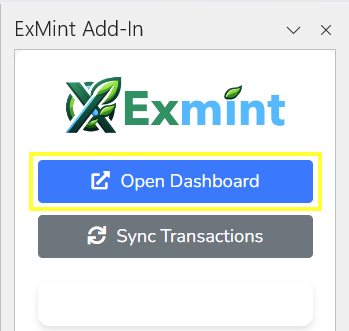
- Click the button. This will open the ExMint web dashboard in your default browser.
- You’ll be automatically logged in using your Excel add-in credentials.
The web dashboard offers additional features such as:
- Detailed transaction search and filtering
- Account management (adding or removing bank connections)
- Advanced reporting and visualization options
Note: Always ensure you’re on a secure network when accessing financial information online.
Description of the Excel Dashboard
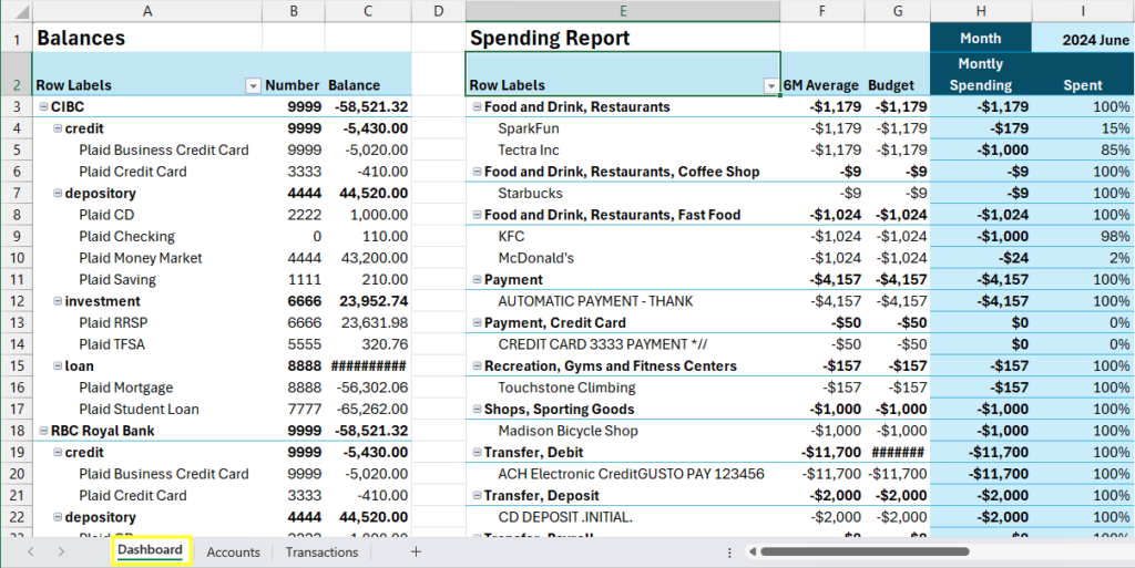
The Dashboard (sheet) is the central hub of the ExMint Add-In where you can view and manage your financial data. The Dashboard provides a comprehensive overview of your accounts, transactions, and budget performance. Here’s a breakdown of the main components you’ll find on the Dashboard:
- Row Labels: The first column in the Dashboard, providing categories for the data.
- Number: The second column displays unique identifiers for various accounts or transactions.
- Balance: The third column shows the balance for each account or transaction category.
- 6M Average: This column provides a six-month average of your spending in each category.
- Budget: The budgeted amount for each category.
- Monthly Spending: The actual spending for each month.
- Spent: The amount spent in each category.
- Custom Category: Allows you to create and manage custom categories for your transactions.
Explanation of Each Component in the Dashboard
- Row Labels:
- This section categorizes the data into various types such as credit, depository, investment, and loan accounts.
- Subcategories include specific account types like Plaid Business Credit Card, Plaid CD, Plaid RRSP, etc.
- Number:
- Unique identifiers are assigned to each account or transaction to help distinguish between them.
- Balance:
- Displays the current balance of each account. Positive balances indicate deposits or savings, while negative balances indicate debts or expenses.
- 6M Average:
- This column shows the average spending or income for each category over the past six months, helping you track your financial trends.
- Budget:
- Displays the budgeted amount for each category, allowing you to compare your actual spending against your planned budget.
- Monthly Spending:
- Shows the amount spent in each category for the current month.
- Spent:
- This column provides the total amount spent in each category, allowing you to track your spending habits.
- Custom Category:
- You can create custom categories to better organize and track your transactions based on your specific needs.
How to Interpret the Financial Data Displayed
- Balances: Positive balances in depository and investment accounts indicate savings or investments, while negative balances in credit and loan accounts represent debts or liabilities.
- 6M Average vs. Monthly Spending: Comparing these columns helps identify spending patterns and areas where you might be overspending or under-budgeting.
- Budget vs. Spent: This comparison allows you to see if you are staying within your budget for each category. If the spent amount exceeds the budget, it indicates overspending.
- Custom Categories: Use custom categories to tailor the financial data to your specific requirements, making it easier to manage and analyze your finances.
Visual Representation
Below is a visual representation of the Dashboard layout based on the provided screenshots:
Tips for Using the Dashboard Effectively
- Regularly Sync Transactions: Keep your data up-to-date by regularly syncing your transactions.
- Review Your Budget: Frequently review your budget and spending to ensure you are on track.
- Utilize Custom Categories: Customize your categories to better reflect your unique financial situation.
- Analyze Trends: Use the 6M Average to identify long-term spending trends and adjust your budget accordingly.
By effectively using the Dashboard, you can gain better control over your finances and make informed decisions to achieve your financial goals.